

The layout is the foundation for creating a whole among graphic elements to guide the movement of the eye and convey a specific message or communication goal. It also plays a crucial role in creating a successful design, making promotional content easily attract potential customers. Especially in advertising, if the layout is not appropriate, your message will not be conveyed effectively.
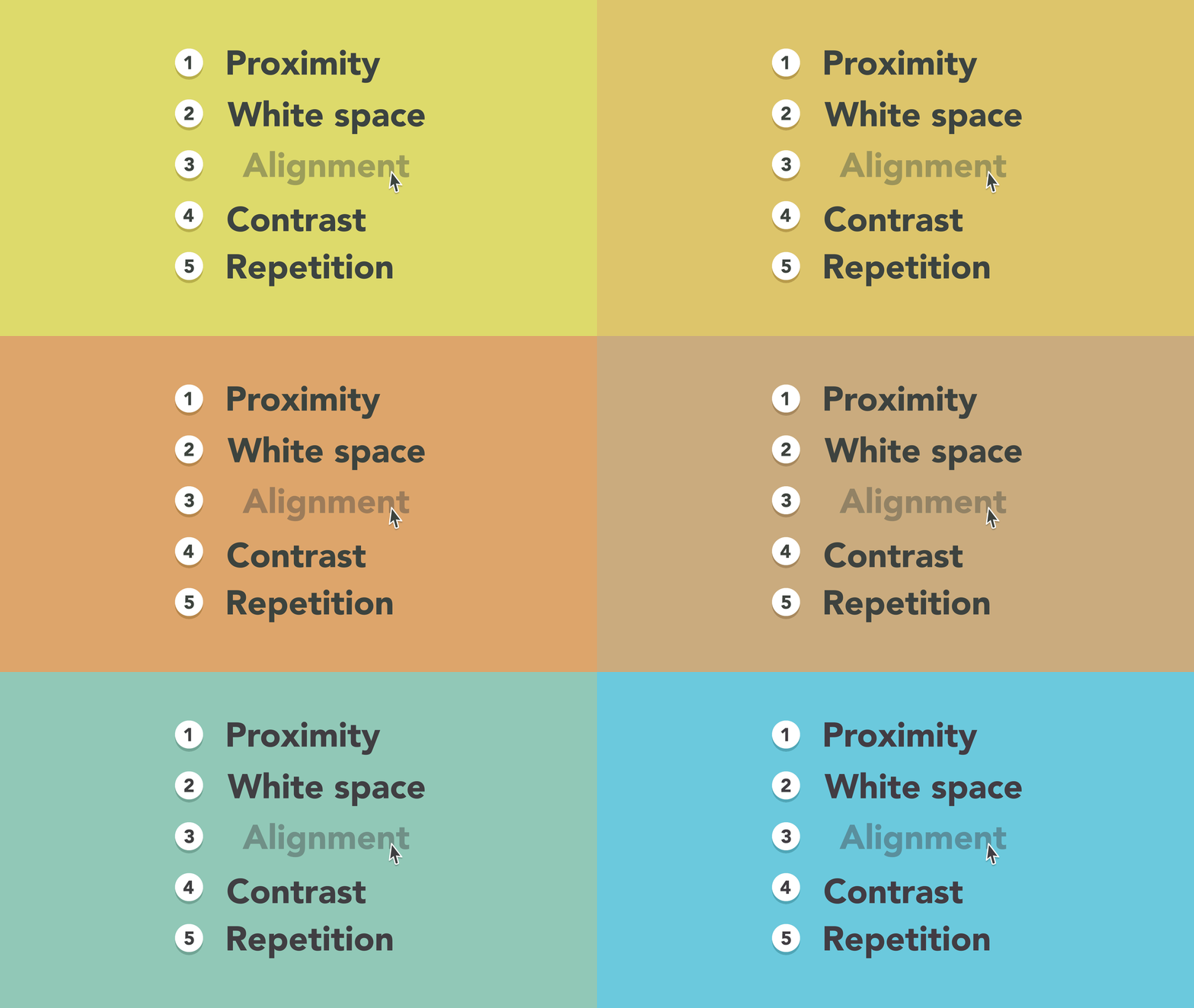
The key to mastering layout principles as a professional designer. There are 5 basic principles that can help you enhance your skills.
The key to mastering layout principles as a professional designer. There are 5 design principles. Remember them and find ways to apply them in your next projects.
1. Proximity
Proximity is the use of visual space to display relationships within content. All you have to do is ensure that related items are grouped together (for example: components in a block of text or graphics, as in the example below).
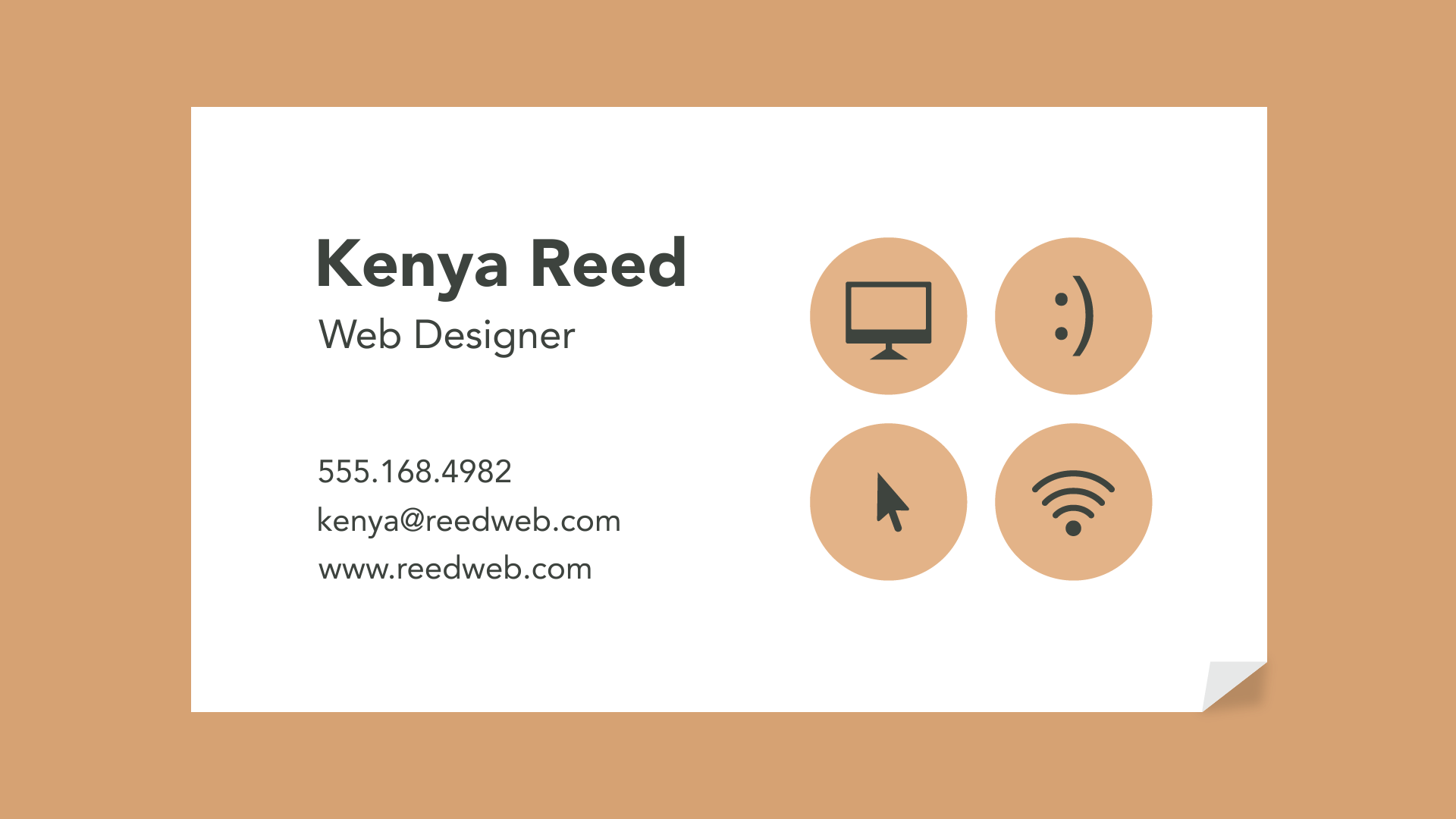
Unrelated groups should be separated to visually emphasize their lack of relationship. Generally, this makes your design easier to understand at a glance, whether it is pure text or something more visual.
2. White Space
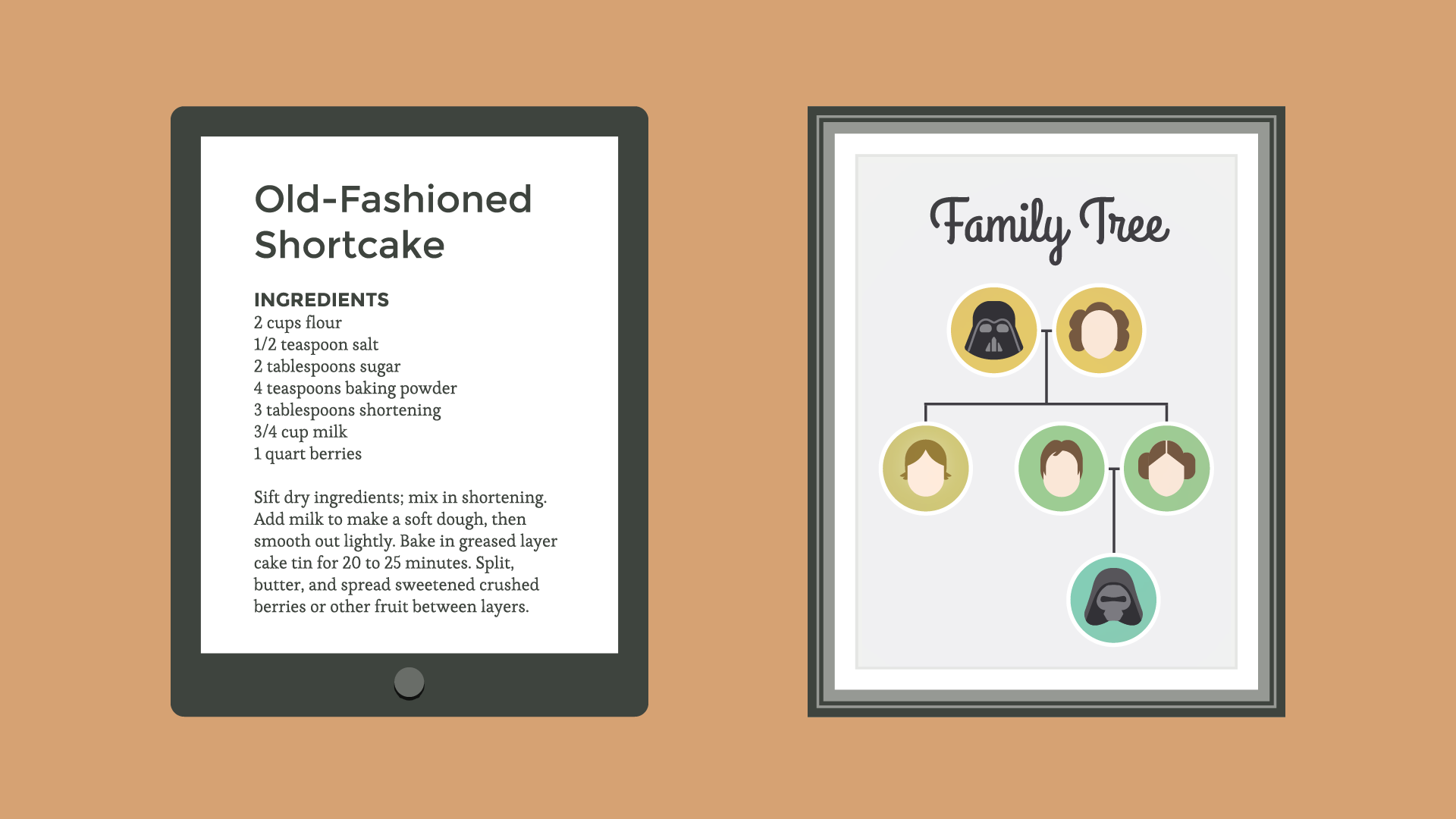
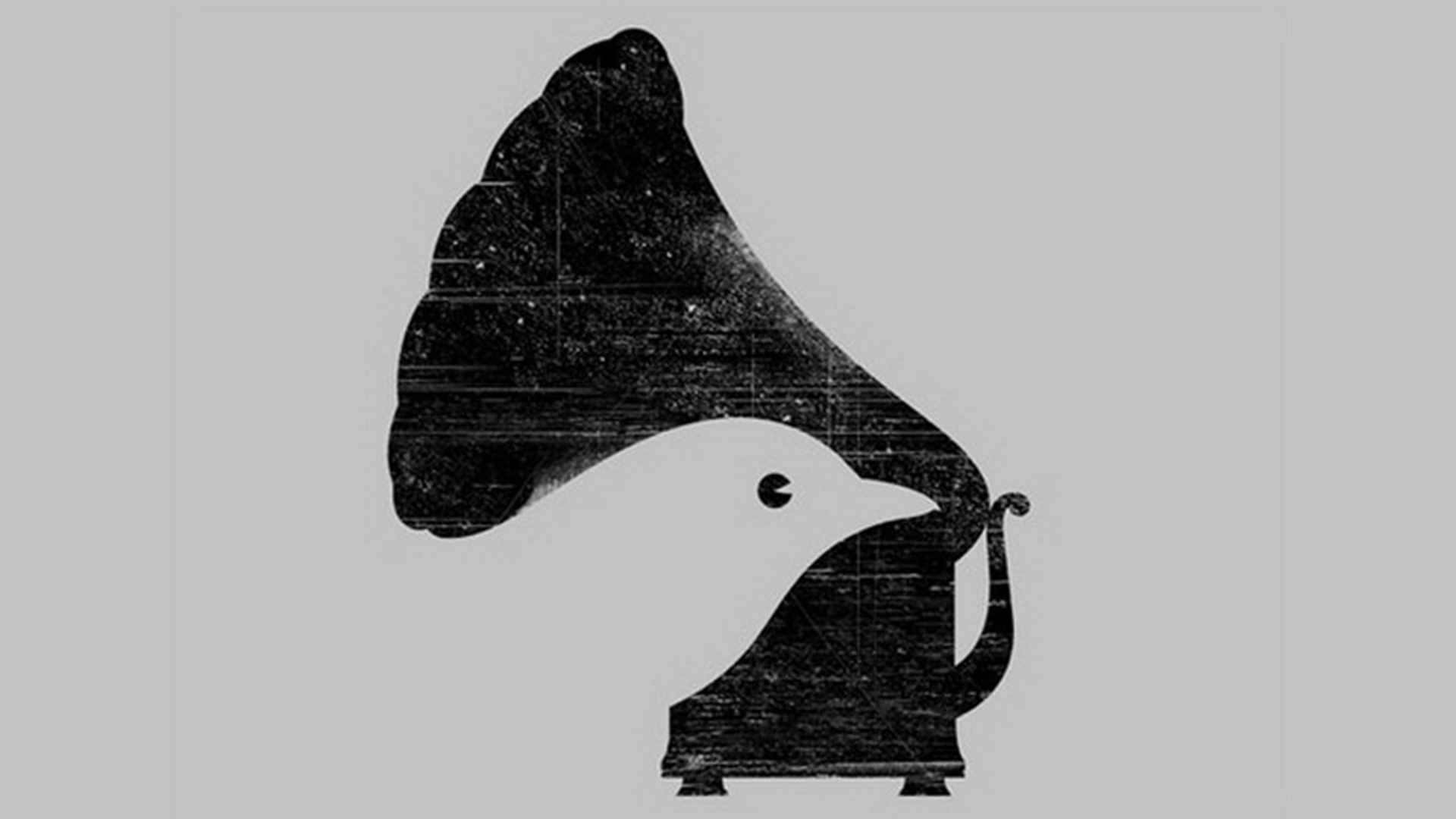
White Space is an important part of any layout. Here, it does not mean it has to be white; it also refers to negative space. Although it can be challenging to incorporate negative space into design, once you can do it, it will make your design incredibly effective.
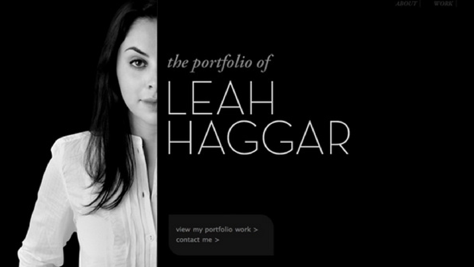
Any design needs to have White Space. White Space helps you define and separate different parts; it gives your content room to breathe. A design without White Space will make it feel too cramped. The viewer's eye will be distracted everywhere and cannot focus on the message the designer wants to convey.
3. Alignment
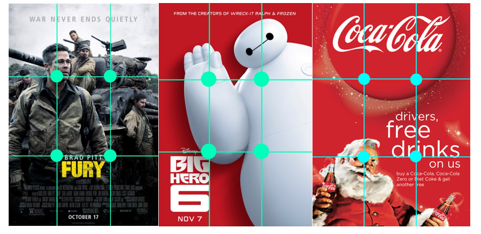
Alignment is one of the most fundamental principles in graphic design. Aligning elements on a page helps tighten the design and create a visual connection between them.
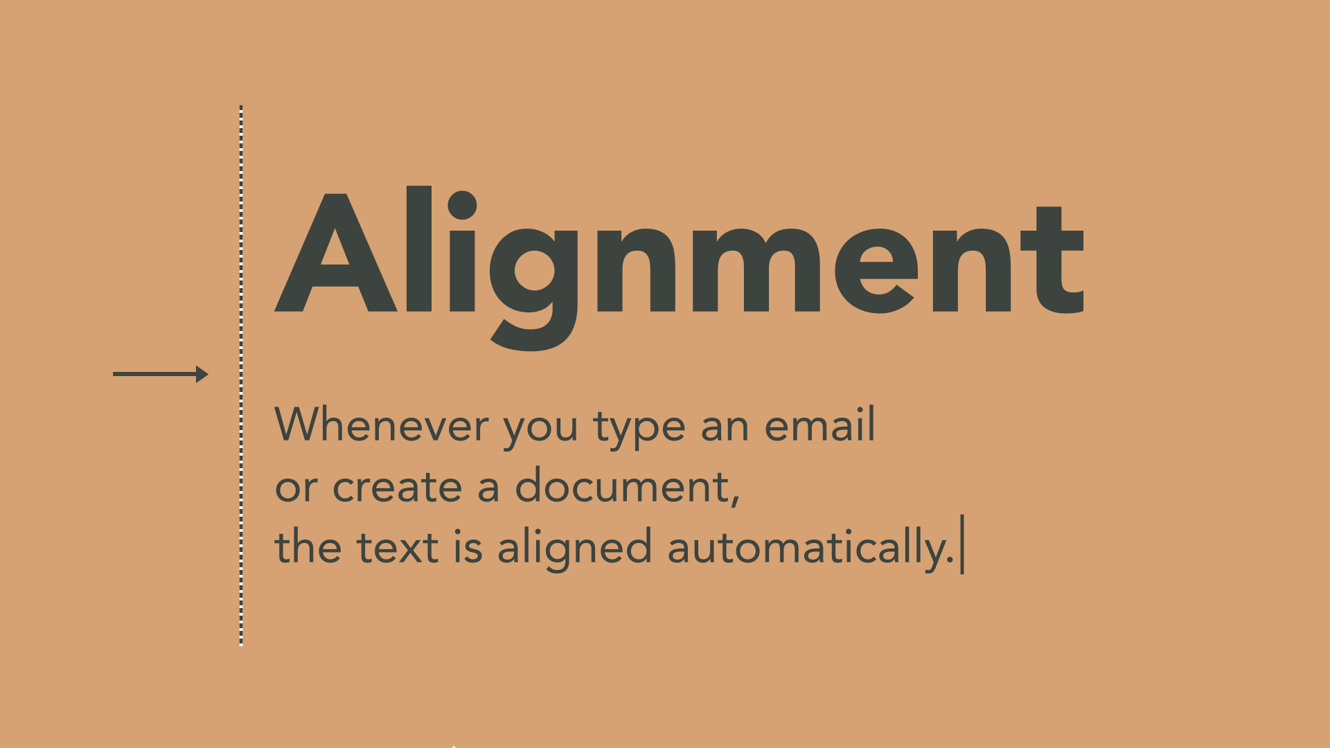
When it comes to self-arranging objectives (for example: individual images or text boxes), it can be challenging to get it right. The most important thing is to be consistent.
The best and safest way is to stick to a single alignment option as long as it meets the design purpose. Using principles and grids for more complex layouts requires precise positioning of elements (as in the example below).
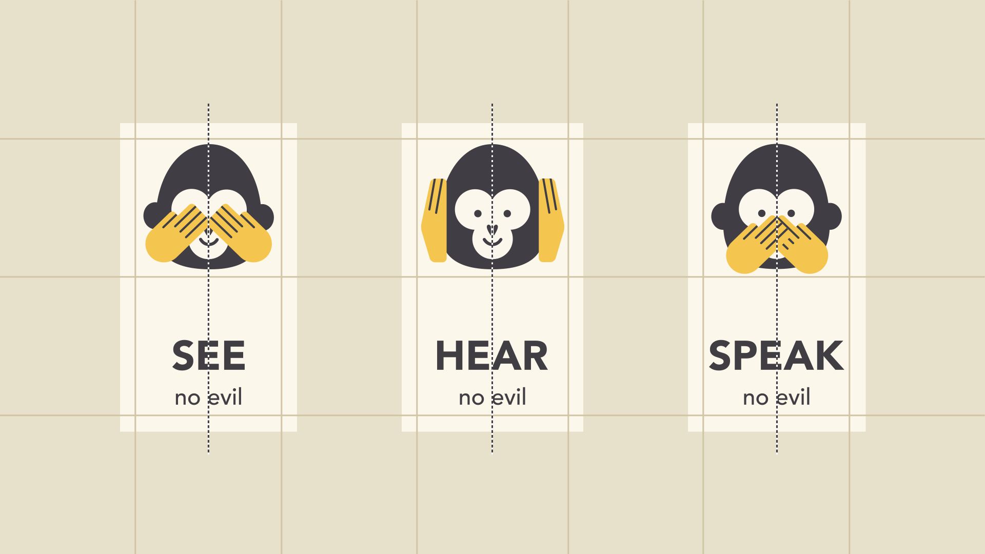
It is this attention to detail that makes the layout easier to navigate. Combining too many different alignments, such as center, justify, and left align on one page can still create an unorganized and illogical appearance.
4. Contrast
Contrast simply means the stark difference in characteristics, levels, states, etc., between two elements.

Contrast occurs when you simultaneously use Colors (Warm – Cool), Lines (Straight – Curved, Horizontal – Vertical, etc.), Shapes (Solid – Hollow, Large – Small), Forms (Square – Round), Textures (Smooth – Rough), Rhythm (Fast – Slow), Space (Wide – Narrow), Uniformity – Diversity, Direction, etc.
In layout design, contrast can help attract the reader's attention, emphasize an important point, or draw attention to a key point.
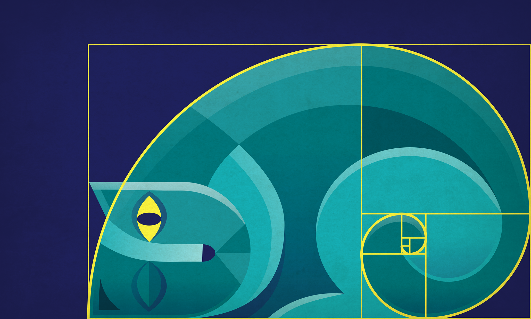
You can use contrast according to some classic rules like the Golden Ratio with ratios: 1:414, 1:618.
5. Repetition
Repetition in design simply means reusing similar or identical elements throughout the design work.
For example, if you have a specific color palette, find ways to implement it. If you have chosen a special header style, use it consistently.
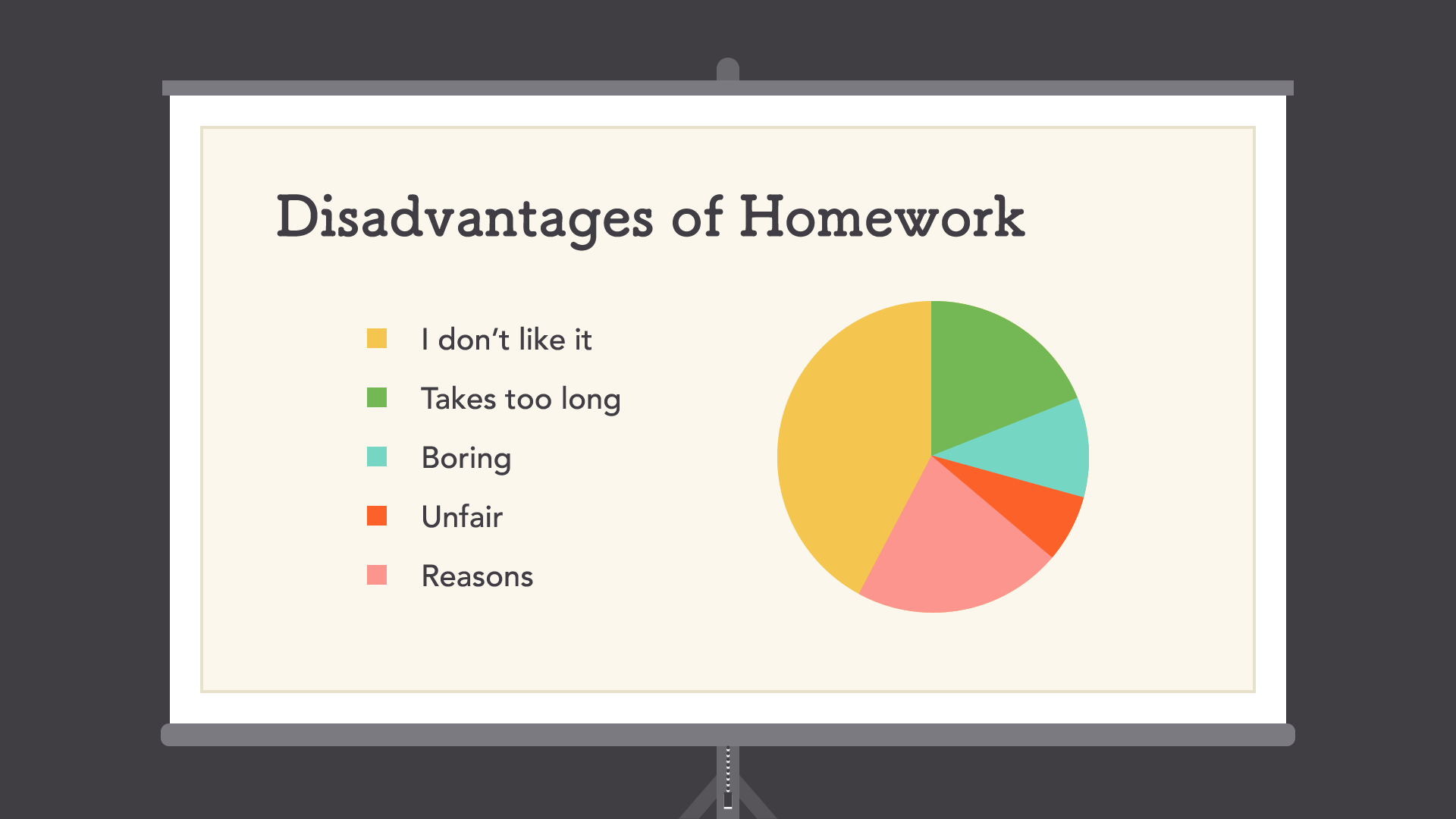
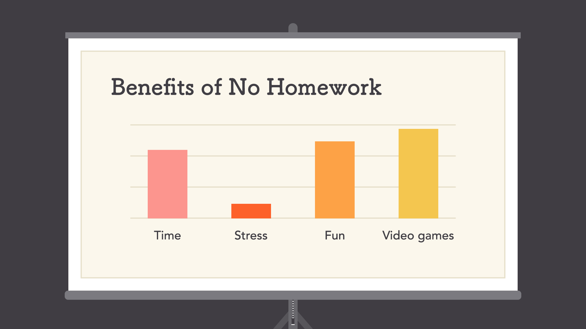
Not just for aesthetic reasons — consistency can also make your work easier to read. When viewers know what to expect, they can relax and focus on the content.
Conclusion
It can be said that components and layout in design are the unsung heroes of design. It is easy to overlook their role, but they are part of everything you do.
The principles you just viewed can help you enhance your skills in any project. All it takes is a little attention to detail, and you can create beautiful, professional layouts.
Article shared by Tài Nguyễn


0 Comments
Be the first to leave a comment on this post.