
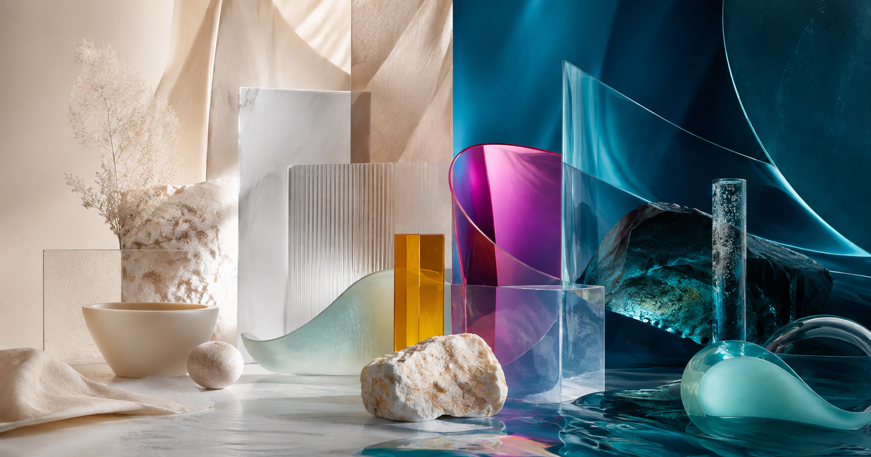
If you simply ask, "What color will be hot in 2026?", it is easy to fall into a list of colors chosen subjectively. A more reliable approach is to compare multiple color forecasting systems, see which signals are repeated, and understand why those colors emerge.
The year 2026 is a particularly interesting example. Pantone has chosen PANTONE 11-4201 Cloud Dancer as the Color of the Year 2026 — a light white shade, which Pantone associates with the need for calm, focus, and simplification in a noisy world. Meanwhile, WGSN and Coloro have selected Transformative Teal — a blend of deep blue and aquatic green — as a symbol of change, redirection, and ecological responsibility.
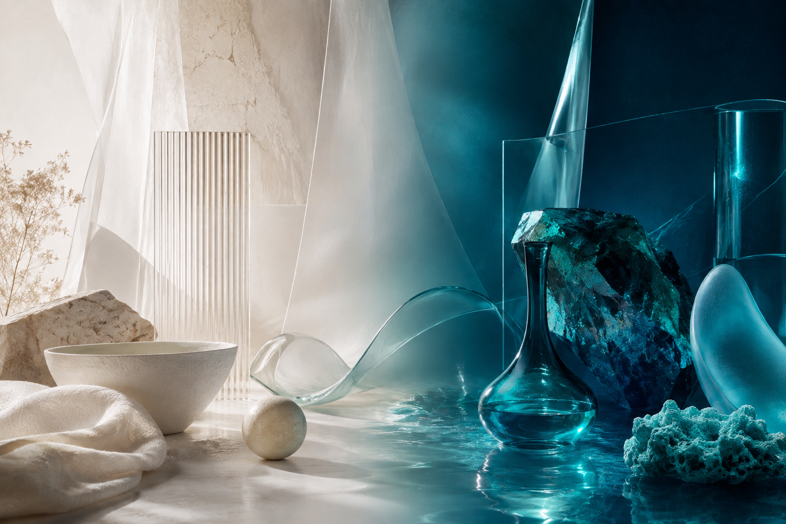
Color trends are not a palette to copy
Pantone describes the Color of the Year as a program that reflects broader cultural states, while WGSN and Coloro build Key Colours ahead of the season based on changes in consumer behavior, society, industry, and the environment. The two approaches are not the same, so the results do not necessarily overlap.
The greatest value of trend forecasting is not to give designers a color code to copy. It indicates where tastes are shifting and what emotional needs are influencing color decisions.
1. Cloud Dancer — the need for breathing space and reducing noise
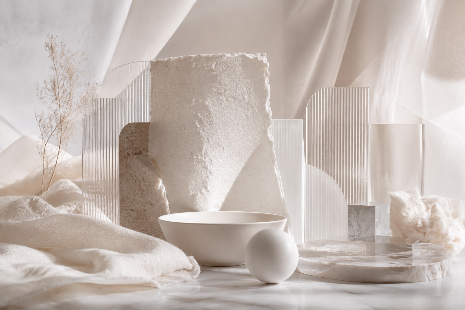
Pantone has chosen PANTONE 11-4201 Cloud Dancer as the Color of the Year 2026. Pantone describes this as a light white shade, embodying the spirit of a "blank canvas", aimed at calmness, clarity, and the ability to create space for new ideas.
This should not be simply understood as "white is trending". A more notable signal is the return of airy neutral: light, soft colors that are less distracting but still have warmth, texture, and a sense of material. The Pantone Fashion Colour Trend Report Spring/Summer 2026 in London also includes White Onyx and Angora in the group of seasonless shades.
Appropriate applications
- Websites and UIs that need to reduce visual noise.
- Premium packaging, beauty, wellness, and lifestyle.
- Brand systems that want to give more breathing space to products and photography.
- As a background to make accent colors stand out more.
2. Transformative Teal — nature intersecting with technology
WGSN and Coloro have chosen Transformative Teal as the Colour of the Year 2026. WGSN describes this color as a combination of dark blue and aquatic green, associated with a phase of "redirection": changing how society, industry, and people interact with the environment.
What makes Transformative Teal notable is that it does not sit entirely on the "nature" or "technology" side. It can simultaneously evoke associations with water, ecology, science, future materials, and the digital environment. Thus, teal becomes an attractive choice for brands wanting to talk about sustainability without appearing rustic or nostalgic.

Appropriate applications
- Clean technology, mobility, energy, and sustainable products.
- Packaging with a story about materials or circular design.
- Branding needing a dark alternative to traditional navy.
- Dark mode UIs needing depth but not overly corporate.
3. Electric Fuchsia — digital energy and the need for self-expression
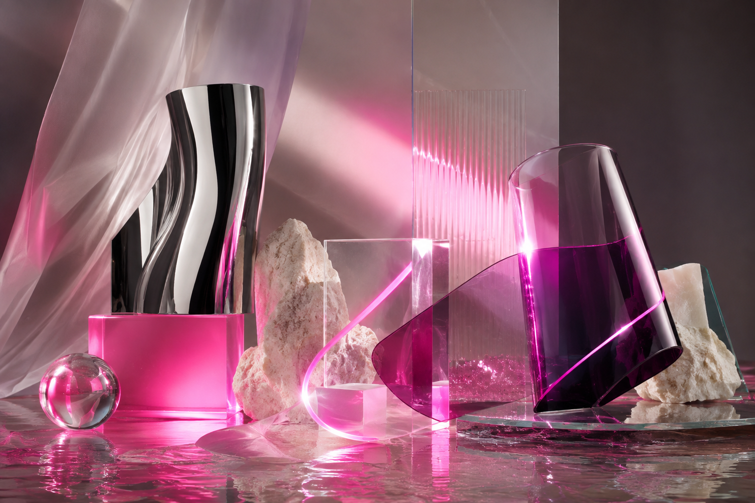
In the list of Key Colours Spring/Summer 2026, WGSN/Coloro includes Electric Fuchsia — a neon color between pink and purple — in the main color group. WGSN relates this hue to digital energy, escapism, rebellion, and a post-human aesthetic in the context of AI continuing to blur the lines between real and artificial.
This is also a case that shows how a forecast can gradually be validated by the market. By July 2026, WGSN continues to mention Electric Fuchsia in the context of pink football boots at the 2026 World Cup, indicating that the forecast signal has shifted to actual products.
Appropriate applications
- Entertainment, music, gaming, and sports culture.
- Fashion, beauty, and brands aimed at self-expression.
- Accent in AI/digital products wanting to avoid overly familiar purple-green aesthetics.
- Campaigns needing high-energy visuals.
4. Blue Aura — soft blue but not old-fashioned
Blue Aura is another Key Colour from WGSN/Coloro for Spring/Summer 2026. WGSN describes it as a tinted pastel blue mixed with gray, possessing both soothing qualities and a futuristic and industrial feel. This color direction can appear on matte, metallic, anodized, lacquered, or surfaces with a light feel.
Notably, blue has not disappeared in the age of AI; it is being refreshed. Instead of just corporate blue, designers can explore more layers: pale blue, blue-gray, aquatic blue, and dark maritime blue.

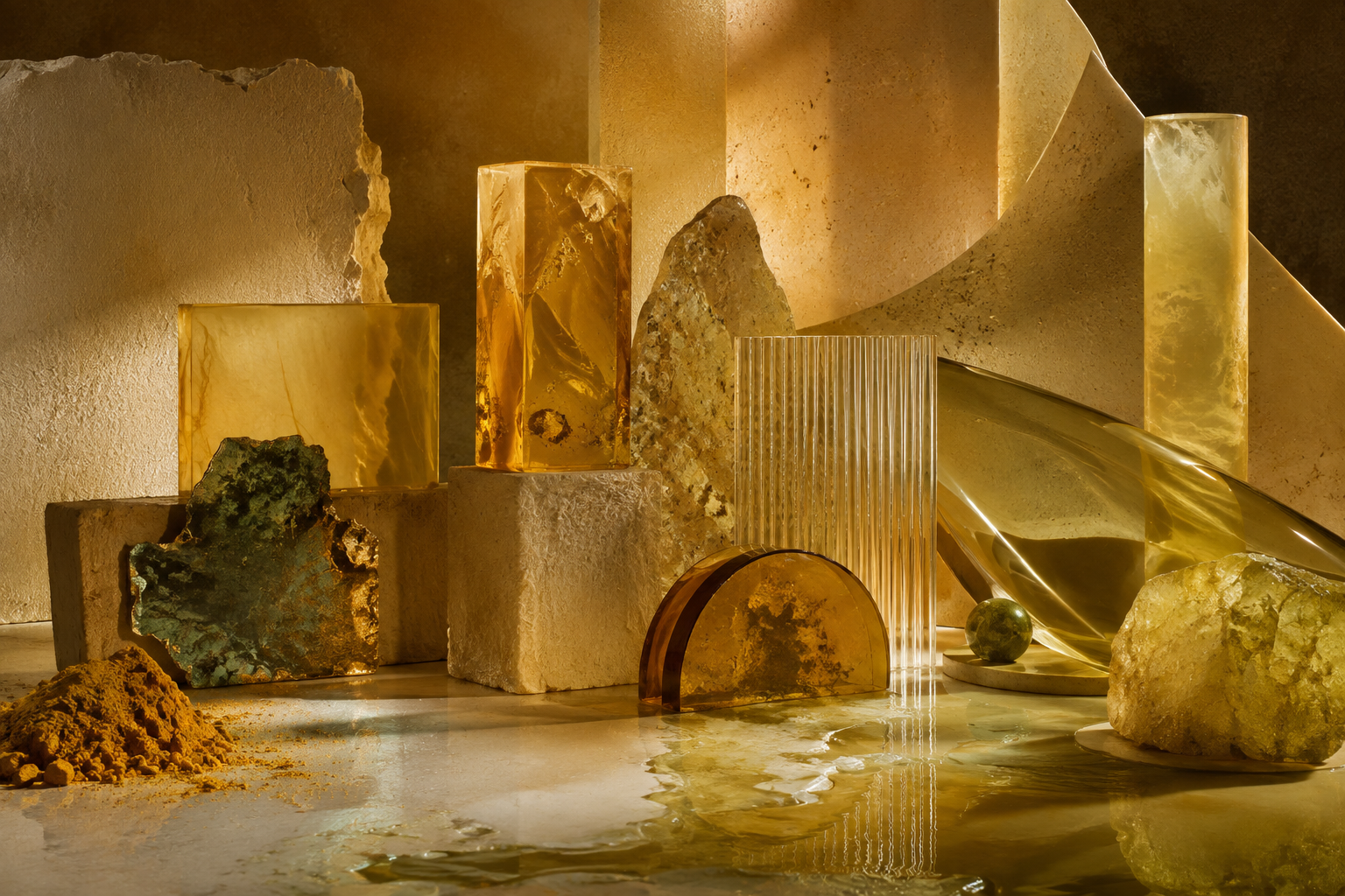
5. Amber Haze — earthy but not safe
Amber Haze is a green-toned yellow in WGSN/Coloro's Spring/Summer 2026 forecast. WGSN relates it to stones, minerals, ancient pigments, and the search for more sustainable coloring methods.
This is a good example of how "earth tones" are changing. Instead of just familiar beige, terracotta, or brown, earth colors can become more unusual, slightly acidic, somewhat mineral, and feel both ancient and futuristic.
6. Jelly Mint — micro-joy and the return of cheerful colors
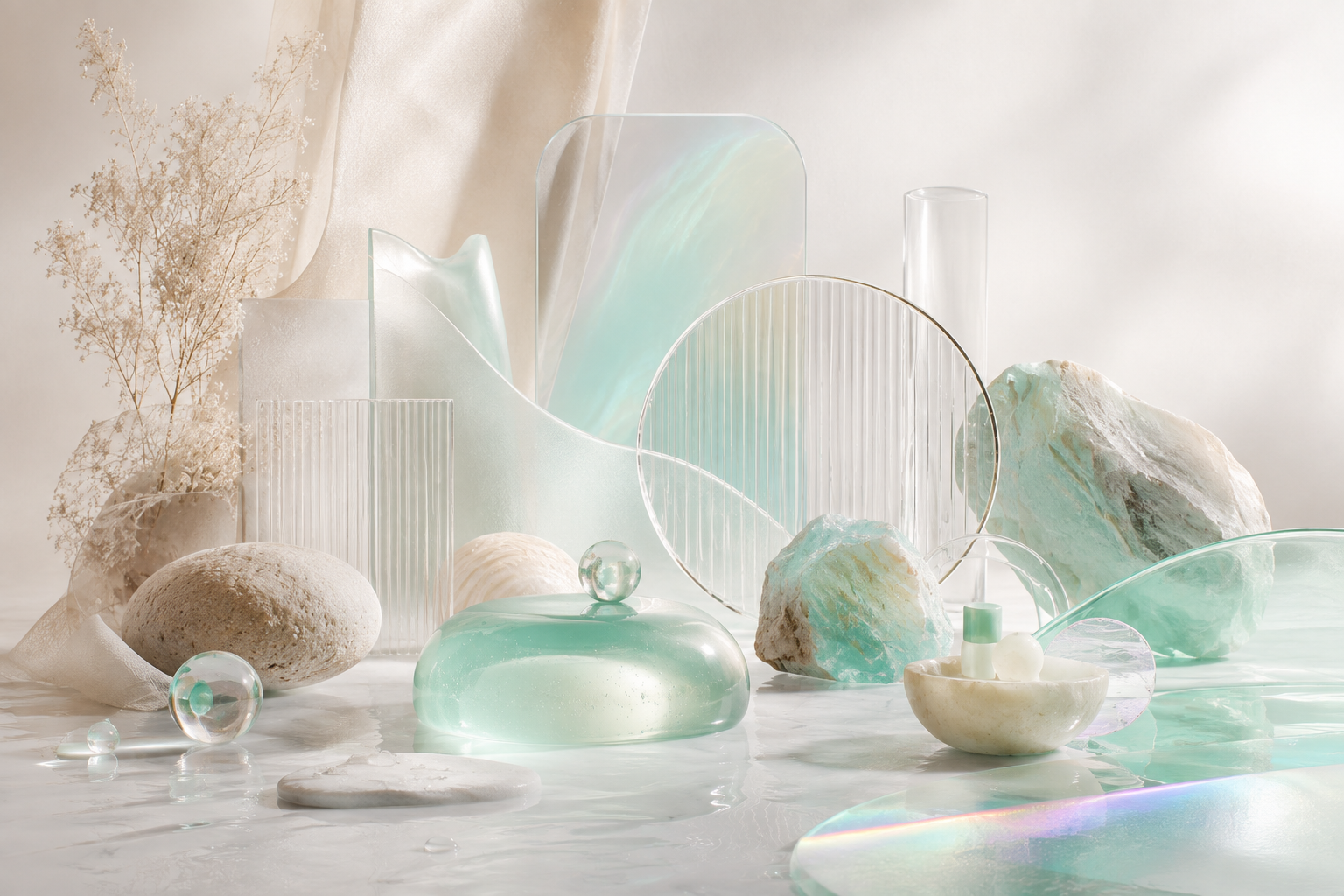
WGSN/Coloro includes Jelly Mint in the Key Colours S/S 2026 with its youthful, playful qualities and its connection to kawaii, kidult culture, and "micro moments of joy".
This creates an interesting counterpoint to Cloud Dancer. On one side is the need for calm and reducing noise; on the other side is the need to find small, light, and escapist joyful moments. These two directions can coexist in a design system: neutral as a background, bright color as an emotional trigger.
So where are the color trends of 2026 really heading?
If we place Pantone and WGSN/Coloro side by side, 2026 does not give us a single dominant palette. Instead, it presents pairs of opposing but coexisting needs:
How should designers use color trends?
Trend forecasting is useful when it helps us understand why tastes change. It becomes dangerous when it is turned into a checklist: "2026 must use teal", "AI must use fuchsia", or "premium must use off-white".
- Check brand fit: Does the color truly match the brand personality or is it just trendy?
- Check hierarchy: Does the color help users understand the interface better?
- Check accessibility: Contrast and state must still meet practical usage requirements.
- Check materials: Colors on screen, print, fabric, plastic, paint, and packaging are not the same.
- Check longevity: Is the design still reasonable when the trend passes?
Conclusion
If I had to distill the color trends of 2026 into six grounded signals, I would choose: Cloud Dancer, Transformative Teal, Electric Fuchsia, Blue Aura, Amber Haze, and Jelly Mint.
What is noteworthy is not that these six names will replace all other color palettes. Their value lies in reflecting larger movements: the need to reduce noise, ecological responsibility, phygital feelings, healing, natural materials, and small joyful moments in an increasingly digital life.
Therefore, a designer does not need to "chase the color of the year". What needs to be done is to understand the signals, choose the right context, and make color a part of the design decision — rather than just decoration.


0 Comments
Be the first to leave a comment on this post.