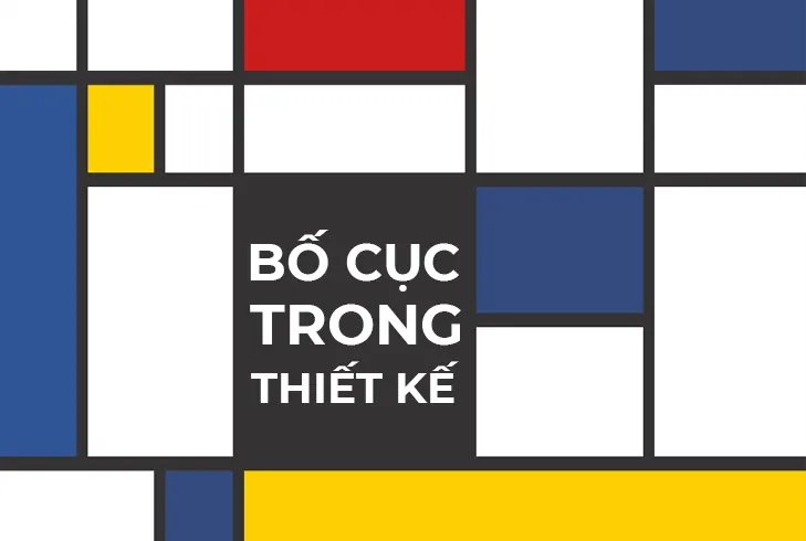
Layout is not just about making a page look better. It decides what people read first, where they pause, and what they remember last.

Start with intent
Before drawing grids or spacing blocks, define the single thing the reader must understand in the first few seconds. Clear intent gives the layout a direction.
- Place the most important information in the first visual zone.
- Keep enough whitespace so the content can breathe.
- Avoid splitting one message into too many disconnected blocks.
A good layout does not impress people with complexity. It helps them understand the point immediately.
Three practical checks
In real projects, I usually check hierarchy, balance, and scan speed on mobile. If those three are working, the layout is usually strong enough to move forward.
- Hierarchy must be obvious: title, supporting copy, action.
- Rhythm should be controlled: not every section needs a different pattern.
- Mobile must be readable without zooming or unnecessary horizontal scrolling.
A solid layout is not the one with the most effects. It is the one that delivers information the fastest and most clearly.

0 Comments
Be the first to leave a comment on this post.