Portfolio article
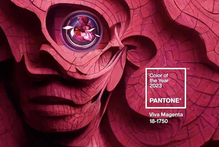
Color of the Year 2023
Viva Magenta is not just a trend color. It signals emotion, context, and how a brand wants to show up.
A trend color is often discussed for its visual appeal, but the real value lies in how it behaves inside a brand system or a real product.
Why trend colors still need discipline
A strong color can create energy, but without control it becomes noise very quickly. The key is to assign it the right job.
- Use the accent color for emphasis, not for every element.
- Keep neutral surfaces around it so the color can breathe.
- Check contrast in both light and dark modes.
A good color does not work alone. It makes the entire system clearer.
Where to apply it
In branding, the color can appear in the hero, badge, illustration, or CTA. In UI, it should be limited to positive states, highlights, and primary actions.
- Hero: build first-impression energy.
- CTA: pull attention to the main action.
- Status: use it for success or important emphasis.
When used with restraint, a trend color can make a brand feel current without sacrificing long-term consistency.
Discussion
Your thoughts
There are no comments yet. Be the first to share your thoughts on this article.